
Sunday, 16 January 2011

Saturday, 16 October 2010
Thursday, 3 June 2010
Chris Ofili

I really enjoyed Chris Ofili's exhibition. I love the way he used the stereotyped images of black culture and used them to his advantage to create great contemporary works of art. In his work I found traditional ways of painting put in a contemporary context. I was moved by these paintings full of colour and very dynamic. I think my favourite painting was afrodizzia. The colours are stunning. When I was looking at it I could feel his love of music and a lot of humour. It makes me think of some kind of hallucination someone would have while on drugs where faces with afros would appear. The ambiance of the upper room was nice. I liked the way the paintings where lit and how their reflection appeared on the wooden floor. I found the series of monos interesting. They all gave out different feelings just by the change of colour used. He used strong colours but managed to give transparence and delicateness to the paintings.
EFF
WFTO (world fair trade organization)
Wfto is composed with more than 400 organisations. In the past years their sale have been growing at a 35% rate. The members are in 70 countries across Africa, Asia, Europe, Latin America, North America and the Pacific Rim. They all believe that trade should improve the lives of marginalized people without harming the planet.
By linking and promoting sustainable fair trade organisations, the wfto improves the well being of disadvantaged producers and their communities. This can be done through campaigning, policy, marketing and monitoring.
Their goal is to: Develop market for Fair Trade, Build trust in Fair trade, Speak out for fair trade.
Fairtrade Certified Cotton
For some of the world's poorest countries cotton is what their economies depend on. Cotton is important at both local and national levels. Fair-trade cotton brings social and environmental benefits to farmers involved in its cultivation. The social and economic benefits are that it increased income by guaranteeing farmers a better price for their cotton, the communities are developed by including a premium that is set aside to invest in social and environmental projects that ensure that the communities have the ability to fund long term improvement. The environmental benefits are that there is responsible farming. The farmers are committed to reduce chemical use and protecting the environment. The impact is reduced by reducing and replacing conventional pesticides and fertilisers with natural alternatives. Fair-trade standards prohibit the use of genetically modified cotton seeds.
Made-By
There mission is to improve environmental and social conditions in the fashion industry.
They were founded in 2004 in the Netherlands and launched in Germany in 2008 and UK in 2009. They work with brands to improve sustainability across their supply chains from raw materials to finished products. They want to help address a wide range of issues including child labour, unsafe working conditions, pesticides in cotton farming and water usage in dyeing houses. They use respected international standards to measure the progress of brands and are then demonstrated through made-by's scorecard system. These scorecards are shared with brands and are published online.
Horniman Museum
When I went to the Horniman Museum I spent most of my time in the beautiful garden and in the African worlds part. I particularly liked the details in the masks. The art room Benin had lovely colours and stylised geometric shapes patterns and faces. The exhibition on china's symbols in silk was stunning. There was so much detail in the embroidery on the garments and the delicacy of the shoes.




Sunday, 30 May 2010
object analysis
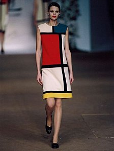
I chose the example of YSL’s Mondrian dress inspired by Piet Mondrian’s painting.
Presented in the autumn-winter 1965-66 collection. It was made out of White black and taupe wool jersey.
Was on the cover of French winter vogue of 65.
Unlike the other fashion houses who, at that time where still working on designs drawing the women’s waist, YSL created a straight dress with a print inspirited by Mondrian’s painting. A boldness that will owe him the eulogy of the American press and the nickname “King of Paris”.
Before becoming a designer YSL wanted to be a painter, he was particularly interested in Bauhaus, cubism and futurism. He made his designs inspired by the many paintings often geometric styles that he loved and collected with his associate and companion Pierre Bergé. Matisse, Goya, Gericault, Ingres, Manet, Degas, Gris, Braque… From ancient to Modern Art. He liked the idea of liking paintings and fashion, he was persuaded that a painter is still from out time and can accompany everyone’s lives.
YSL thought that the planarity of the 60’s sack dress was ideal for colour blocks. His first reference was Mondrian his design was very structured precise parallel with primary colours. We could consider it as a test to the spectator. By using very simple motifs he could only sublime the dress. He worked in collaboration with Piet Mondrian to create his collection. In the collection he made other Mondrian dresses with different compositions and colours. He reinterpreted Mondrian’s work in his own way.
YSL’s tributes broke ranks between artistic styles. The Mondrian dress had such an impact through the international fashion world. the Mondrian look appeared in all price ranges and all kinds of garments, from shoes (Nike to hats …) It was also seen in furniture ( the Gerrit Tomas chair) and even Architecture (schoder house). Since then the designer regularly mixed his work with the art world in what he called his dialogues : Mondrian, wesselman, Poliaoff, Van Gogh, Matisse, Picasso, Braque, Léger, Apollinaire, Aragon, Cocteau, Laulanne any loads more.
These artists permitted him to reinvent a language which became his.
Wednesday, 3 February 2010
Essay suject
I would like to explore what movements in painting are revisited in the fashion industry today and why.
I shall look at the following questions.
What age group is targeted?
Why has this trend to include an influence from pictorial art only come about now? (And has it?) What started it? For this last question I will attempt to explore a specific example of this trend.
How did paintings become a fashion accessory? How did pictorial art become included in the world of fashion and become a trendy detail?
How are these works of art revisited in order to adapt to contemporary fashion today? Can art equal fashion? The meaning of a painting will surely change if reused for fashion purposes. Can the painting be connected with fashion and not lose its universal artistic value?
Are these mutations only appearing in fashion or also in our contemporary visual environment?
I shall develop my argument by making plastic studies of the popular works of art that stand out in this new wave of fashion. This will help me to understand and explain their mutations. (colour scale, compositions...)
Some examples of artists that have been used are Keith Harring, Warhol, Jean Michel Basquiat, Van Gogh, and Mondrian.
Based on the exhibition, Foundation Cartier Paris « Né dans la rue », Tate Modern « POP Life », the « Palais de Tokyo» and « Colette» shops Paris.
Wednesday, 9 December 2009
Jewellery Box
Chair
If this Baroque chair was on a stall in the street the people walking by would notice it but would look at it thinking it's bad taste and over the top.
Telescope
The key words that came to my mind when I saw this object where vintage, adventure, voyage, world, wealth, museum. I could imagine this telescope in a explorer's town house office right next to a big wooden globe.
If this was exposed in a museum I think people would admire it and observe it in it's detail. They would try and guess the story behind it and who it belonged to.
Notting Hill
Fourty years ago Notting Hill was definitly a no-go area. It was described as a "massive slum" full of multi occupied houses. But in the past 30 years there has been a massive transformation and now has a great statue.
This area is popular for antique and music shops around Notting Hill Gate.
It's very quiet on week days but on saturdays the place is packed for the Portobello market. The market sells mostly antiques but because of the tourists is has become less authentic. Notting Hill is also known for it's carnival which takes place in august. It's a celebration of the Caribbean culture. The carnval started in the 60's as a positiv responce to immigrant communities.
The name Notting Hill is very old and comes from the Saxons "Cnotta".
This area used to be entirely rural and was part of Kensington's parish.
Notting Hill Gate is where the gate was installed on London's main road to maintain it's quality. This gate was taken away in the 19th century.
Notting Hills big Town-houses where designed by Ladbroke Thomas Allon. His idea was to build the houses surrounding a commune garden, so the gardens are not visible from the street.
Once built the Notting hill houses where not as popular as expected because rich families like living more central. So the houses where inspired by the Belgravia models but cheaper.
In the 20th century when wealthy families stopped employing domestiques the biggest houses where divided in multiple lodgings. But in the 80's the occupation of the whole house was fashionable again and now Notting hill is one of London's areas the most appreciated.
Tuesday, 8 December 2009
Telling Tales
In 'The Forest Glade' the 'Petit Jardin' chair caught my attention. I found it intriguing in it's detail. It had a traditional enchanted fairytale look. The disordered natural shapes and the flowery cuttings give the idea of forest vegetation but the laser cut shapes are so neat and sharp it makes it look dangerous. The colours and material used give a futuristic and almost unfinished design to this piece.
In 'Heaven and Hell' I didn't really know what to think of 'Damned.MGX'. At first I found it disturbing, it looked like a pile of corpses and violent bodies. It reminded me of some kind of barbaric battle scene. But when I looked closer I found a certain grace. Some of the bodies look like their floating, as if they were in water. The repetition an synchronization reminded me of a water ballet. But even though the colour, shape of the sculpture and bodies look pure their tortured faces give a disturbing, morbid feeling.
In the 'Enchanted Castle' I was amazed by the lightness I found in Jeroem Verhaeven's 'Cinderella Table'. It is made of marble and very imposing but it looks smooth and light. I like how the designer used the outline of a classic table and the material that would be found in a wealthy household. I found interesting how he used the traditional look and mutated it in a very modern shape cut in an old solid bloc.
The objects of the exhibition are well lit and displayed as if they were put in a living situation. In the 'enchanted castle' the mirrors on the walls and floor give an oppressing feeling to the room. The objects are reflected, multiplied and are shown in different angles to the public which creates a dramatic sensation.
These art pieces are all very different from one another in their shapes and colours but all have the same theme. This is what makes them relate to each other and work together in creating a ambiance to the room. I could make my collection more interesting by finding a way to make my objects relate to each other in space and theme to get a feeling of nostalgia.
The titles ' Enchanted Castle' and 'Heaven and Hell' are two titles I find appropriate for these exhibits.
In 'Enchanted Castle' the objects and furniture are fantastical. The designs of many of these objects recall the 18th century which is often evoked by fairytale writers and illustrators. Some of the exposed objects are a parody of high status by their exageration, materials and changes of scales. These objects show a image of wealth and magic as we can often find in fairy tales.
In 'Heaven and Hell' it is not all clear what resembles more to heaven or to hell. Some of these objects are heavenly in their shape and grace but look more like hell in their meaning or detail. This room is like a conflict between life and death, judgement and salvation. It all has to do with the mortality of men and often the afterlife. The materials are manly cold and hard but the shapes are purified.
I particularly liked 'Linen-Cupboard-House' I find the subject of childhood interesting in many ways. This piece reflects well the innocence, simplicity and naiveness in the way the children build houses for their make believe adventures.